Kivyで角が丸くて押した時に背景色が変わるボタンを作るの巻
はじめに
こういうボタンにしたいぞ、と。
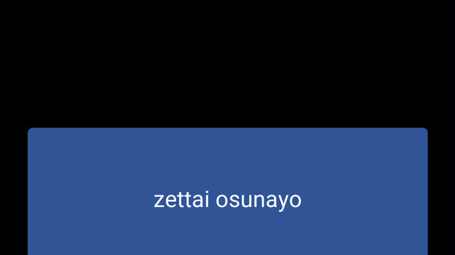
角が丸くて、押した時にちゃんとフラッシュするボタンです。
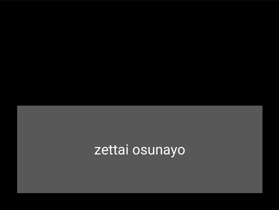
PythonでGUIのアプリを作ることができるKivyですが、Buttonのウィジェットで作ったボタンがデフォルトでは四角なので、、、
こんなかんじ。
ちょっと角を丸くしたいな、と。
ということで調べたらレクチャーしてくれている動画(参考にしたサイト 1)があって、
おかげさまで角が丸いボタンをうまく作ることができました(ついでに背景色も変更できました)。
こんなふうに。
んが、今度は押したときにフラッシュしなくなりました。これではボタンを押したかどうかがわかりにくいのです。
いちおう押したことにはなりますが、手応え(?)がないのは寂しい。
ので、冒頭にあるようにフラッシュするようにさらに手を加えました。
探してもずばりの情報がなかったので、備忘録として残しておくことにしました。
しかしKivyの公式ドキュメントってなんかわかりづらい。。。気がする。。。
とりあえず、本記事で取り扱っているメモは、
・Buttonウィジェットで作成したボタンの角を丸くする(背景色も変える)
・角を丸くしたボタンでも押した時にフラッシュするようにする
・(おまけ)角を丸くしたToggleButtonでOnのときに色を変える
の三本です。
それでは見ていきましょう。あ、コードが簡単なもので試しているので今のところうまくいってますが、もしかして不具合が出るような方法だったらすみません。
やり方
ここでは、Pythonファイル(.py)とKv languageファイル(.kv)を分けた形で実施しています。
Buttonウィジェットで作成したボタンの角を丸くする(背景色も変える)
まずはButtonを作らなきゃです。
buttontest.py
from kivy.app import App
from kivy.uix.boxlayout import BoxLayout
from kivy.uix.label import Label
from kivy.uix.button import Button


#give class the name of Otameshi
class Otameshi(BoxLayout):
    pass

#give class the name of ButtontestApp
class ButtontestApp(App):
    def __init__(self, **kwargs):
        super(ButtontestApp, self).__init__(**kwargs)

    def build(self):
        return Otameshi()

if __name__ == '__main__':
    ButtontestApp().run()
Buttonを読み込んでいます。今回使うのでBoxLayoutとLabelもimport。
WidgetクラスはOtameshiっていう名前にしてます。
Appのクラス名をButtontestAppにしているので、kvファイル名はbuttontest.kvにすれば勝手にkvファイルを読み込んでくれます。
次に、
buttontest.kv
<Otameshi>
    BoxLayout:
        orientation:'vertical'
        size:root.size
        padding:(100,100)
        Label:
            id: lab1
            text: self.text
            font_size: 80
        Button:
            size: 100, 200
            text: 'zettai osunayo'
            pos: 0,0
            font_size: 80
            on_press: root.ids['lab1'].text='osunatte'
            on_release: root.ids['lab1'].text=''
on_pressとon_releaseで、ボタンをクリックした際にidがlab1であるlabelのテキストを書き換えるようにしています。
で、ボタンができました。
それでは、このボタンの角を丸くして背景を変更してみます。このボタンのcanvasを使います。
buttontest2.py
from kivy.app import App
from kivy.uix.boxlayout import BoxLayout
from kivy.uix.label import Label
from kivy.uix.button import Button

#added below for making rounded button
from kivy.graphics import Color, RoundedRectangle


#give class the name of Otameshi
class Otameshi(BoxLayout):
    pass

#give class the name of Buttontest2App
class Buttontest2App(App):
    def __init__(self, **kwargs):
        super(Buttontest2App, self).__init__(**kwargs)

    def build(self):
        return Otameshi()

if __name__ == '__main__':
    Buttontest2App().run()
canvasで使うColor, RoundedRectangleを追加しています。
kvファイルのほうは、
buttontest2.kv
<Otameshi>
    BoxLayout:
        orientation:'vertical'
        size:root.size
        padding:(100,100)
        Label:
            id: lab1
            text: self.text
            font_size: 80
        RoundedButton:
            size: 100, 200
            text: 'zettai osunayo'
            pos: 0,0
            font_size: 80
            on_press: root.ids['lab1'].text='osunatte'
            on_release: root.ids['lab1'].text=''

<RoundedButton@Button>
    background_color:(0,0,0,0)
    background_normal:''
    text_size: self.width, None
    halign: 'center'
    canvas.before:
        Color:
            rgba:(48/255,84/255,150/255,1)
        RoundedRectangle:
            size: self.size
            pos: self.pos
            radius:[18]
Buttonを継承したRoundedButtonクラスを、<RoundedButton@Button> とすることで追加しています。
backgroud_color:(0,0,0,0)、 background_normal:” で、もともとの背景色が影響を与えないようにしています。
canvas.beforeのColorで背景色を決めています。
RoundedRectangleのradiusで角の丸みを決めています。
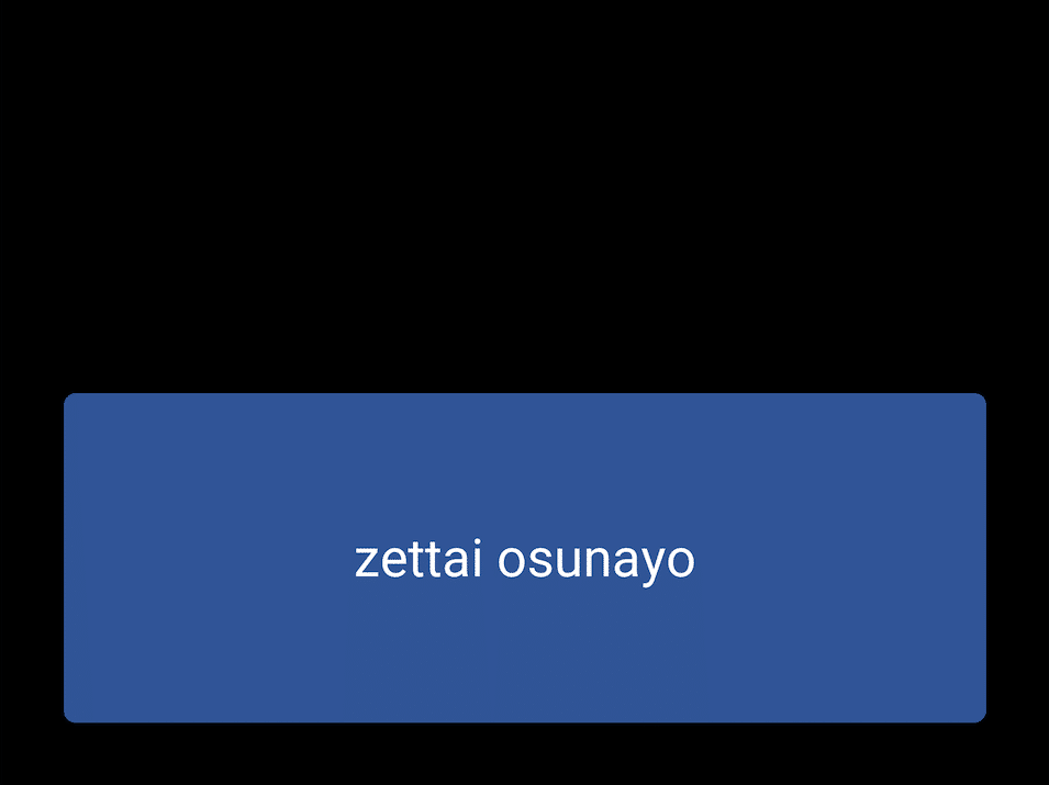
で、角が丸くて背景色を変更したボタンができました。でも押した時にフラッシュしなくなってもうた。
角を丸くしたボタンでも押した時にフラッシュするようにする
ボタンのstateに合わせた背景色を設定することで、押した時にフラッシュするようにできました。
buttontest2r.py (buttontest2.pyと同等です。Appクラス名が違うだけ。)
from kivy.app import App
from kivy.uix.boxlayout import BoxLayout
from kivy.uix.label import Label
from kivy.uix.button import Button

#added below for making rounded button
from kivy.graphics import Color, RoundedRectangle


#give class the name of Otameshi
class Otameshi(BoxLayout):
    pass

#give class the name of Buttontest2rApp
class Buttontest2rApp(App):
    def __init__(self, **kwargs):
        super(Buttontest2rApp, self).__init__(**kwargs)

    def build(self):
        return Otameshi()

if __name__ == '__main__':
    Buttontest2rApp().run()
buttontest2r.kv
<Otameshi>
    BoxLayout:
        orientation:'vertical'
        size:root.size
        padding:(100,100)
        Label:
            id: lab1
            text: self.text
            font_size: 80
        RoundedButton:
            size: 100, 200
            text: 'zettai osunayo'
            pos: 0,0
            font_size: 80
            on_press: root.ids['lab1'].text='osunatte'
            on_release: root.ids['lab1'].text=''

<RoundedButton@Button>
    background_color:(0,0,0,0)
    background_normal:''
    text_size: self.width, None
    halign: 'center'
    canvas.before:
        Color:
            rgba:(255/255,0/255,102/255,1) if self.state=='down' else (48/255,84/255,150/255,1)
        RoundedRectangle:
            size: self.size
            pos: self.pos
            radius:[18]
Colorのrgbaにおいて、ボタンのstateが’down’の時に色がrgbaの(255/255,0/255,102/255,1)に変わるようにしました。
そうすると、
でけた。
(おまけ)角を丸くしたToggleButtonでOnのときに色を変える
ToggleButtonのときも同様にできます。
buttontest3.py
from kivy.app import App
from kivy.uix.boxlayout import BoxLayout
from kivy.uix.label import Label
from kivy.uix.button import Button

#added below for making rounded button
from kivy.graphics import Color, RoundedRectangle

#added below for using toggle button
from kivy.uix.togglebutton import ToggleButton


#give class the name of Otameshi
class Otameshi(BoxLayout):
    pass

#give class the name of ButtontestApp
class Buttontest3App(App):
    def __init__(self, **kwargs):
        super(Buttontest3App, self).__init__(**kwargs)

    def build(self):
        return Otameshi()

if __name__ == '__main__':
    Buttontest3App().run()
ToggleButtonを追加でimportしています。
kvファイルは、
buttontest3.kv
<Otameshi>
    BoxLayout:
        orientation:'vertical'
        size:root.size
        padding:(100,100)
        Label:
            id: lab1
            text: self.text
            font_size: 80
        RoundedToggleButton:
            size: 100, 200
            text: 'zettai osunayo'
            pos: 0,0
            font_size: 80
            on_press: root.ids['lab1'].text='osunatte'
            on_release: root.ids['lab1'].text=''

<RoundedToggleButton@ToggleButton>
    background_color:(0,0,0,0)
    background_normal:''
    text_size: self.width, None
    halign: 'center'
    canvas.before:
        Color:
            rgba:(255/255,0/255,102/255,1) if self.state=='down' else (48/255,84/255,150/255,1)
        RoundedRectangle:
            size: self.size
            pos: self.pos
            radius:[18]
Buttonの代わりにToggleButtonを設置しているだけです。。。
こちらもでけた。めでたしめでたし。
と、思ったら、KivyMDというマテリアルデザインを志向したライブラリがあるではありませんか。
ベータ版とされているとはいえ、こんな手間かけなくてもできるんやん。。。(*´Д`*)
ちょっと広告です
https://business.xserver.ne.jp/
https://www.xdomain.ne.jp/
★LOLIPOP★
.tokyo
MuuMuu Domain!
実施環境
Python 3.9.4
Kivy 2.0.0
macOS Catalina ver.10.15.7
参考にしたサイト
- https://www.youtube.com/watch?v=gQRcY2y3mkY1 ; RoundedButtonの作り方
- https://qiita.com/kurodae/items/1bfeaf982d82943c1401 ;Toggle Buttonの使い方
https://business.xserver.ne.jp/
https://www.xdomain.ne.jp/
★LOLIPOP★
.tokyo
MuuMuu Domain!