Plotlyのcandlestickチャートでgapになっている期間をno gapで描画するの巻

はじめに
Plotlyでfxのチャートをそのまま描画すると、取引のない期間(日本では土曜の早朝から月曜日の早朝まで)はデータが無いためグラフにgapができてしまい不格好ですので。。。
↓のようにgapを非表示にして描画したい、と。そのやり方のメモです。
方法としては、
rangebreaksを使ってgapとなっている期間を指定し非表示にする
にて、できることがわかりましたよ、と。
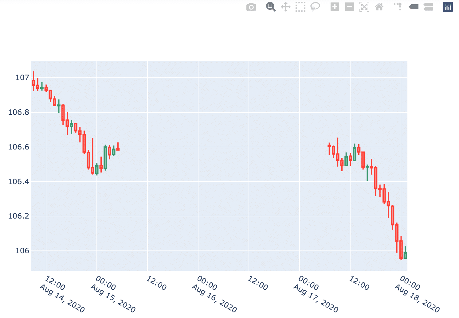
まずは普通に描画してみます
使用したデータ
次に示したpandasのDataFrameを使用します。
display(df)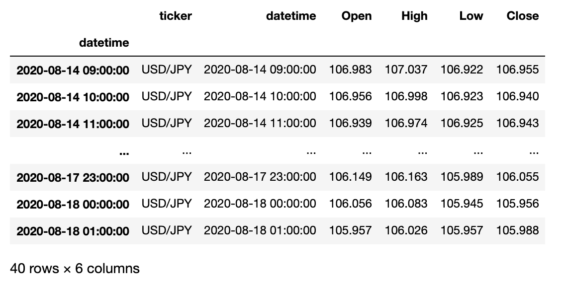
・ドル円の1時間ごとのOHLCデータ
・期間:2020年8月14日(金)09:00 〜 2020年8月18日(火) 01:00
・8月15日が土曜日、8月16日が日曜日です
・gapとなっている期間は
2020-08-15 06:00:00 から 2020-08-17 06:00:00です
・datetimeとなっている列が真ん中にもありますが、index(DatetimeIndexにしています)のほうだけ使います。
Plotlyでローソク足チャートを描画してみます(Gap修正前)
#plotlyで視覚化。
import plotly.express as px
import plotly.graph_objects as go

fig = go.Figure(data = [
        go.Candlestick(
            x = df.index,
            open = df['Open'],
            high = df['High'],
            low = df['Low'],
            close = df['Close'],
            name = 'USD/JPY 1 hr')
])

#range sliderをoff
fig.update_layout(
    xaxis_rangeslider_visible=False
)


fig.show()
と、このように取引が無い期間についてはgapができてしまいます。
Gapのある期間をno gapで描画するやりかた
手順としては、gapとなっている期間のリストを作成し、rangebreaksのvaluesで指定してから描画します。
使用したデータは先ほどのdfです。
Gapとなっている期間のリストを作成する
まず、gapとなっている期間のリストを作成します。
"""
gapとなっている時間を抽出し、リスト名timegapとして取得する
"""

df_resample = df.resample('H').max() #gapの期間中を1時間単位で補間したDataFrameを取得。max()は便宜上入れています。

merged_index  = df.index.append(df_resample.index) #元々のindexとまとめてgapの時間以外を重複要素としてやる

timegap = merged_index[~merged_index.duplicated(keep = False)] #重複要素を除去することでgapとなっている時間を抽出する

display(timegap)
DatetimeIndex(['2020-08-15 06:00:00', '2020-08-15 07:00:00', '2020-08-15 08:00:00', '2020-08-15 09:00:00', '2020-08-15 10:00:00', '2020-08-15 11:00:00', '2020-08-15 12:00:00', '2020-08-15 13:00:00', '2020-08-15 14:00:00', '2020-08-15 15:00:00', '2020-08-15 16:00:00', '2020-08-15 17:00:00', '2020-08-15 18:00:00', '2020-08-15 19:00:00', '2020-08-15 20:00:00', '2020-08-15 21:00:00', '2020-08-15 22:00:00', '2020-08-15 23:00:00', '2020-08-16 00:00:00', '2020-08-16 01:00:00', '2020-08-16 02:00:00', '2020-08-16 03:00:00', '2020-08-16 04:00:00', '2020-08-16 05:00:00', '2020-08-16 06:00:00', '2020-08-16 07:00:00', '2020-08-16 08:00:00', '2020-08-16 09:00:00', '2020-08-16 10:00:00', '2020-08-16 11:00:00', '2020-08-16 12:00:00', '2020-08-16 13:00:00', '2020-08-16 14:00:00', '2020-08-16 15:00:00', '2020-08-16 16:00:00', '2020-08-16 17:00:00', '2020-08-16 18:00:00', '2020-08-16 19:00:00', '2020-08-16 20:00:00', '2020-08-16 21:00:00', '2020-08-16 22:00:00', '2020-08-16 23:00:00', '2020-08-17 00:00:00', '2020-08-17 01:00:00', '2020-08-17 02:00:00', '2020-08-17 03:00:00', '2020-08-17 04:00:00', '2020-08-17 05:00:00', '2020-08-17 06:00:00'], dtype='datetime64[ns]', name='datetime', freq=None)
見にくいですがgapとなっていた期間(2020-08-15 06:00:00から2020-08-17 06:00:00)のリストができました。
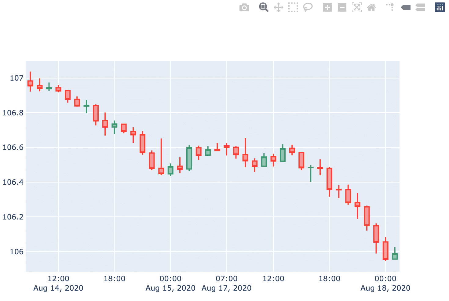
Plotlyでローソク足チャートを描画してみます(no gapで)
先ほど作成したリストをrangebreaksのvaluesにあてがってから描画します。
コードに
fig.update_xaxes( rangebreaks=[ dict(values = timegap, dvalue = 3600000) ]) を追加します。
なお、1時間ごとのデータなので、dvalueを3600000 msec(1 hr)に設定しています。時系列の間隔に合わせてdvalueを設定すれば良いです。
なお、dvalueのデフォルト値は86400000 msecで24 hrとなっていますので、日足データの場合はdvalueの変更は必要ないかと思います。
#plotlyで視覚化。
import plotly.express as px
import plotly.graph_objects as go
from plotly.subplots import make_subplots
fig = go.Figure(data = [
go.Candlestick(
x = df_chart_partial.index,
open = df_chart_partial['Open'],
high = df_chart_partial['High'],
low = df_chart_partial['Low'],
close = df_chart_partial['Close'],
name = 'USD/JPY 1 hr')
])
"""
X軸において、rangebreaksのvaluesにgapとなっている期間のデータポイントのリストを設定することで非表示にする。
"""
fig.update_xaxes(
rangebreaks=[
dict(values = timegap, dvalue = 3600000)
])
#range sliderをoff
fig.update_layout(
xaxis_rangeslider_visible=False
)
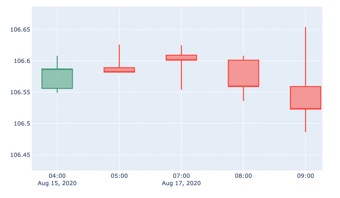
fig.show()該当箇所(2020-08-15 05:00と2020-08-17 07:00)を拡大してみます。
でけた。めでたしめでたし。
環境
この記事の内容は
Python; 3.7.2
Plotly; 4.9.0
pandas; 1.0.5
jupyter; 1.0.0
にて実施しました。
このブログはエックスサーバー
WordPressを使うならロリポップ!
簡単インストール完備で楽々スタート!
世界にたった一つ、あなただけのドメインを登録しよう!
格安ドメイン取得サービス─ムームードメイン─